White Menu
Business Cards
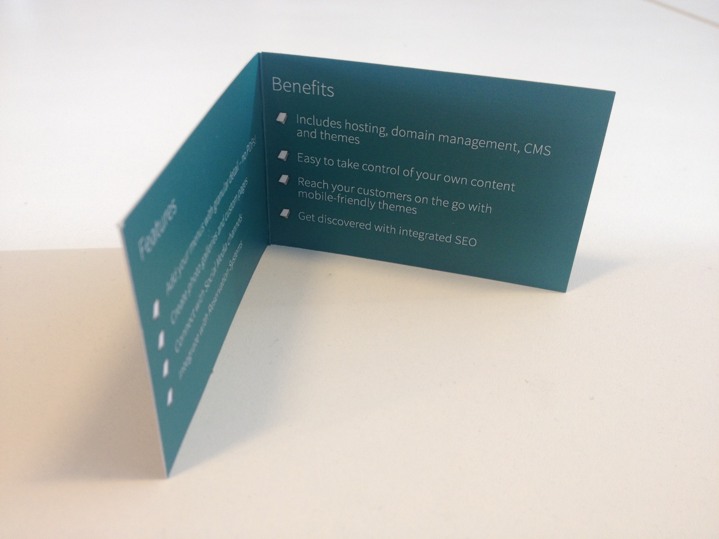
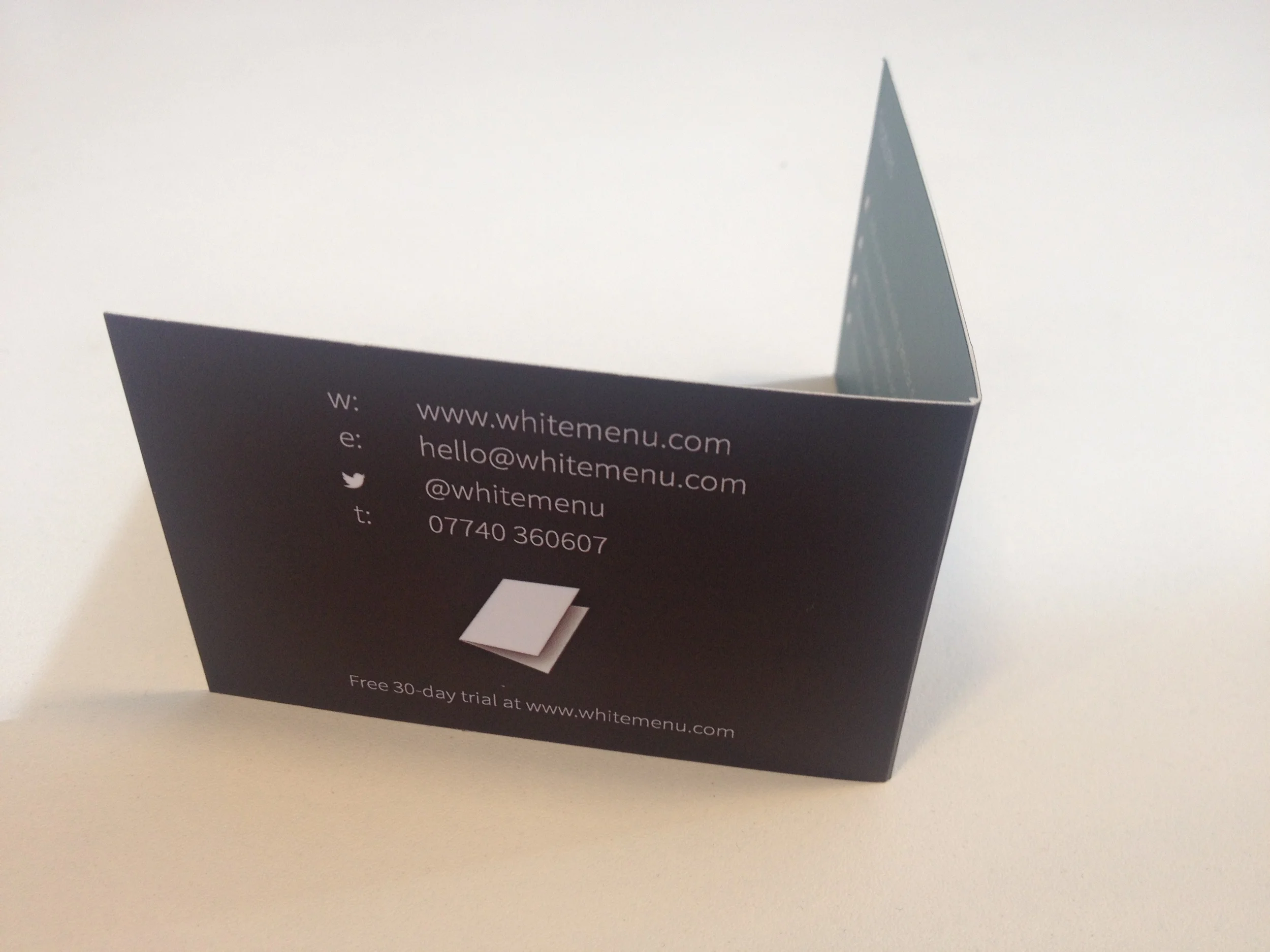
White Menu builds websites for Restaurants, Bars and Cafés. They wanted to use a business card format that matched it's logo icon, as well as product offering. The pamphlet style used makes the business card more like a menu, and allowed more information about the product to be presented to the reader.
Front End
We designed the WhiteMenu website to create a clean and bright interface that guided potential clients through all the information they needed to make the decision to sign up. Features and Pricing are clearly listed, and graphically explained to make the information easy to digest, and the responsive design was considered in desktop, mobile and tablet forms to ensure users attracted on any media had a great experience of navigating the site.
Back End
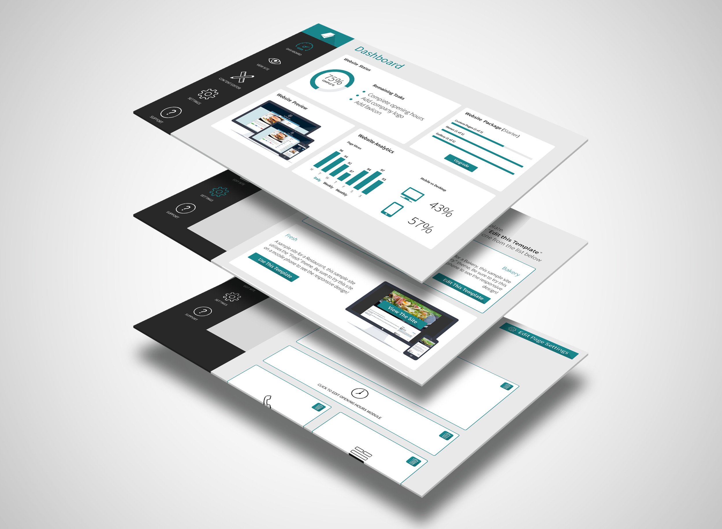
We also designed the back end to WhiteMenu, which allows it's users to build and maintain their own site using the WhiteMenu site builder. We designed custom graphics and dashboards to provide a very visually rich interface in the builder and reporting tools, and made the process of building, customising and updating a site as simple and user-friendly as possible. To achieve this, as well as the aesthetic considerations, we employed our User Centred Design process to optimise the sign-up process, site building process and site maintenance tasks.
The full WhiteMenu site is available to view here; http://www.whitemenu.com/
Testimonial
"We've been working with Prod Designs for about a year now on various design projects. The team are great to work with - they take the time to understand our requirements thoroughly, provide us with a comprehensive set of deliverables and are always flexible enough to meet our occasionally tight deadlines. All of our projects have been a resounding success, and we look forward to continuing our relationship"
Russ Huntington, Founder
T: 0208 226 4977
E: hello@proddesigns.co.uk
© Prod Ltd 2014


